
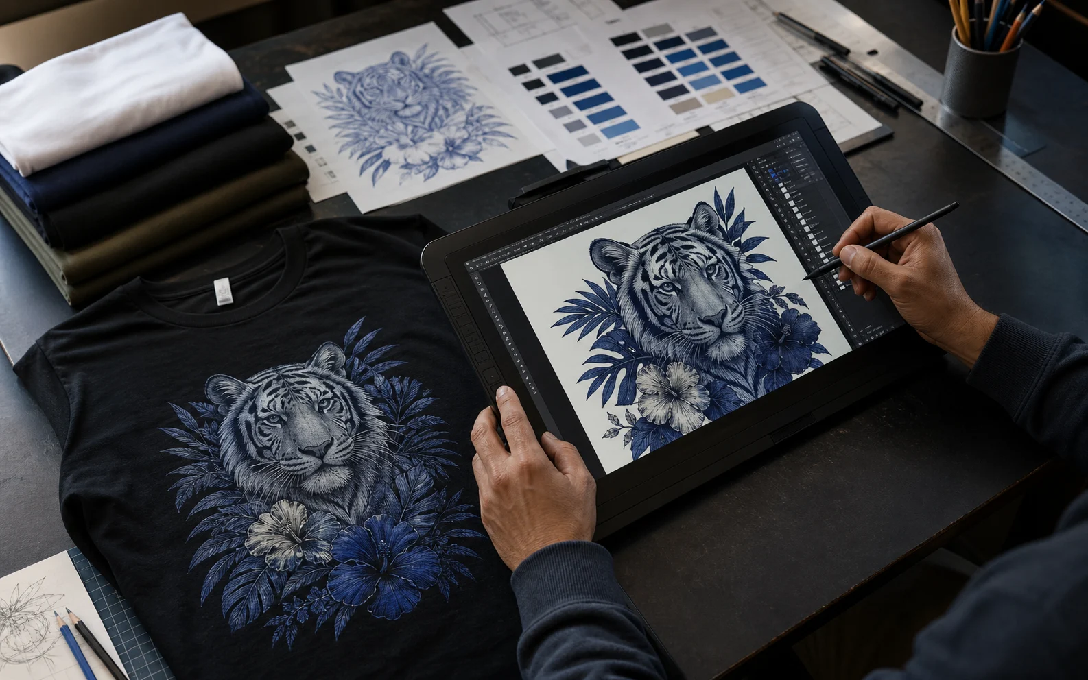
- Design quality is the #1 differentiator between $0/month sellers and $10K/month sellers — not ads, not SEO, not the platform.
- Niche fit beats art skill. A simple typography design that nails the niche outsells a beautiful illustration that misses it 20:1.
- The bestselling POD designs in 2025-2026 are specific, identity-driven, and printable — wide demographics like “Mom” are dead; “Soccer Mom of Twins in Texas” sells.
- File specs matter. 300 DPI, transparent PNG, correct sRGB color, and platform-specific sizing are non-negotiable — wrong specs cause 1-star reviews and account suspensions.
- Most $10K/month sellers do not design themselves — they hire designers (like Prinil) and focus on niches, listings, and ads where their time has higher leverage.
I want to start this guide with the single most uncomfortable truth in print-on-demand: your design is doing 90% of the work, and most sellers spend less than 10% of their time on it.
Sellers obsess over keyword research, A+ content, PPC bids, niche spreadsheets, and the latest TikTok strategy. All of that matters. But none of it matters if the design on the shirt is generic — and most designs are generic, because most sellers are using the same Vexels packs, the same Canva templates, the same Midjourney aesthetic, and the same “Etsy bestseller” recolors that 50,000 other sellers are using right now.
At Prinil we have shipped 500+ original designs for 200+ POD brands across Etsy, Amazon Merch by Amazon, Shopify, Shine On, and Redbubble. We have seen designs that did $0 in 90 days and designs that hit $5K/month in the first 30 days. The difference is never the art skill. The difference is almost always: did the design actually understand the buyer?
This guide is everything we have learned. It is long. Bookmark it. Come back when you are working on a specific design problem and use the table of contents to jump to that section. By the end you will know:
- What makes a POD design actually sell (with the 7-part anatomy)
- How to pick the right niche-design fit (this is where 90% of sellers fail)
- The design trends that worked in 2025 and the ones that died
- Color theory and typography rules specific to printing on apparel
- The 12 most common design mistakes — with before/after examples
- A comparison of every major design tool (Photoshop, Illustrator, Procreate, Canva, Kittl, Vexels, Midjourney)
- Exact print file specs for Etsy, Amazon Merch, Shopify, Shine On, and Redbubble
- When to design yourself versus hire a designer (with the math)
Why Design Is the #1 Factor in POD Success
Every year someone publishes a “POD is dead” article. Every year POD revenue across Etsy, Amazon, and Shopify grows by double digits. What is actually dying is lazy POD — the kind where sellers upload 500 Vexels templates with different niche text slapped on top.
The market is now mature enough that buyers can tell the difference between a designer who understands them and a seller who is gambling with stock art. The good news: this means the gap between a great design and a generic one is bigger than ever. Here is what the data shows.
The 87/13 rule in any POD store
In every store we have analyzed — Etsy, Amazon Merch, Shopify — roughly 87% of revenue comes from the top 13% of designs. The other 87% of designs collectively earn what one or two top designs earn. This is true whether the store has 50 designs or 5,000.
What does this mean for you? It means design quality compounds. Uploading 100 mediocre designs is not 100x better than uploading 1 great one. It is often worse, because mediocre designs eat your impressions, drag your conversion rate down, and get crowded out by the few designs that actually convert.
Design beats niche, niche beats ads
We have a saying internally at Prinil: design beats niche, niche beats ads. Meaning: a great design in a bad niche outsells a bad design in a great niche, and a great design + great niche outsells any amount of paid advertising on a generic product.
This is testable. Take two designs in the same niche — say, “Soccer Mom of Twins” — one custom-designed for that exact buyer, one a Canva template with the words swapped in. Run identical Amazon Merch listings. The custom design will outperform the template by 5-15x in the first 90 days, every single time. We have tested this dozens of times.
The 7-Part Anatomy of a Bestselling POD T-Shirt
Every bestselling POD design we have ever shipped — across t-shirts, hoodies, mugs, tumblers, jewelry, and posters — shares the same seven structural elements. Miss any one of them and conversion drops measurably. Nail all seven and you have something that actually has a shot at the top 13%.
Niche-Design Fit: The Skill That Beats Art Skill
If you only learn one thing from this guide, learn this: niche-design fit is a separate skill from art skill, and it is the more important one in POD.
An art-school graduate with 10 years of illustration training will lose to a 16-year-old kid who deeply understands one niche and designs for it natively. We have seen this happen repeatedly. The kid does not have better art technique — he has better cultural fluency in the niche. He knows the inside jokes, the visual codes, the typography conventions, what the buyers find embarrassing versus aspirational.
Niche-design fit is built three ways:
1. Live in the niche
The fastest way to design for a niche is to be in it. If you are a nurse, you have an enormous advantage designing nurse shirts. If you do CrossFit, you have an unfair edge in fitness designs. Most sellers ignore this and try to design for niches they have never participated in — then wonder why their designs feel hollow.
If you cannot live in a niche, the next best thing is to study it like an anthropologist: read the subreddits, scroll the TikToks, lurk in the Facebook groups, watch the YouTubers in that space. Take screenshots of every visual cliché, inside joke, and shared identity marker you see. After a week of immersion you will know that niche better than 95% of POD sellers.
2. Decode the visual conventions
Every niche has a visual language. Once you can read it, you can write in it. Some examples we keep on file:
| Niche | Typography | Palette | Conventions |
|---|---|---|---|
| Mom / Boy Mom | Script + serif combo | Dusty pink, sage, cream, gold | Mention number of kids, ages, or chaos. Coffee references. “Salty” tone. |
| Nurse / ICU Nurse | Block sans, sometimes script accent | Teal, navy, white, hot pink accent | Specific unit (ER, ICU, NICU). Caffeine, night shift, coding humor. |
| Faith / Christian | Western serif, vintage display | Sage, cream, rust, mustard | Scripture references with verse number. Vintage distressed look. |
| Fitness / 75 Hard / Hyrox | Athletic block, italic display | Black, white, neon green, blood red | Discipline language. No-excuses tone. Race finisher year and location. |
| Patriotic / Veteran | Stencil, condensed serif | Navy, red, distressed cream | Branch, MOS, dates. Distressed/weathered finish. Subdued palette. |
| Pickleball / Golf | Retro 70s display, varsity | Sage, butter yellow, terracotta, cream | Court/course humor. Generational pride (Boomer/Gen X grandparent). |
| Trades / Welder / Electrician | Industrial slab, monospace | Black, safety yellow, blaze orange | Tool references. Self-deprecating tradesman humor. Union pride. |
| Teacher | Hand-lettered script, friendly sans | Pencil yellow, chalkboard navy, apple red, sage | Grade-specific. Curriculum jokes. Summer countdown. |
Notice how specific these are. “Sage” appears in three different niches but is signaling something different each time. The palette is not the design — the palette is a signal that says “I belong here, I get it, I am not an outsider trying to sell to you.”
3. Look at what is already selling — then do the opposite of the worst designs
Browse the top 100 listings in your niche on Etsy or Amazon. Sort by bestselling. Pay attention not to the top 5 (those are saturated and harder to copy ethically) but to listings ranked 30-80. These are the designs making real money without being so dominant that they crush competition. Study what they have in common — and notice what mediocre listings get wrong.
POD Design Trends That Sold in 2025-2026
Trends in POD move on a weird two-speed clock. Aesthetic trends shift slowly (a “retro 70s” trend has been working for 4 years and is still working). Cultural trends move at the speed of TikTok (a meme has a 6-week sales window before everyone is sick of it). The trick is knowing which is which.
Aesthetic trends that are still winning in 2026
- Retro 70s revival — sage, butter, terracotta, rust palette with rounded display fonts. Still dominating mom, teacher, and lifestyle niches.
- Coastal Grandmother / Quiet Luxury — cream, navy, dusty rose, hand-lettered script. Premium-feeling, low-saturation.
- Western / Cowboy Revival — distressed serif, mustard and rust, faith and ranching crossover. Growing in 2026.
- Anti-AI illustration — visibly hand-drawn, slightly imperfect line work. Buyers are tired of AI gloss and will pay more for “real” hands.
- Y2K low-poly + bubble fonts — bright neon, chrome effects. Working for Gen Z humor and gamer niches.
- Type-only / typography-driven — no illustration at all, just powerful word arrangement and color. Cheap to design, easy to scale, very profitable.
Cultural trends with a 4-12 week window
- Specific seasonal moments (Eras tour stops, sports finals, election cycles)
- Viral meme formats (riding for 4-8 weeks max before they go stale)
- New-product references (a movie release, a viral song, a TV show finale)
Trends that died in 2025
- Generic “Live, Laugh, Love” Bella Canvas script. Oversold and now a meme of bad taste.
- Pure Midjourney aesthetic. Buyers can spot AI illustration instantly and increasingly avoid it.
- Overwrought watercolor florals. Worked 2020-2023, now dated.
- Sloppy distressed grunge with no concept. Pure distressing without a strong message reads as filler.
- Multi-word inspirational quotes in three different fonts. Etsy buyers have moved on.
Color Theory for POD — What Print Actually Does to Your Colors
Almost every new POD designer makes the same color mistakes. They design in RGB on a bright monitor, never preview against the actual garment color, and ignore how printers compress gradients. Then they wonder why their first sample looks washed out.
Rule 1: Design in sRGB, not Adobe RGB or CMYK
Most POD platforms (Printful, Printify, Amazon Merch, Shine On) expect sRGB color profile. Adobe RGB has a wider gamut than the printer can reproduce, so those vibrant colors get clipped or shifted during print. CMYK is for offset printing, not DTG. Stick with sRGB unless your supplier specifies otherwise.
Rule 2: 2-5 colors maximum
DTG (direct-to-garment) printers handle simple palettes beautifully and struggle with gradients, photographic detail, and near-white shades. A 2-5 color design will look crisp on every garment color. A 30-color gradient will look muddy. This is why the cleanest, most successful POD designs almost always have a tight palette.
Rule 3: Avoid these specific colors
- Pure white (#FFFFFF) on white shirts — obviously invisible. But also avoid it as a single ink color on dark shirts because pure white ink prints duller than expected.
- Near-white shades (#F5F5F5, #FAFAFA) — these print indistinguishably from the shirt itself.
- Bright fluorescent neons — most DTG inks cannot reproduce true neon. It will print as a flat pastel.
- Pastels under 20% saturation — washed out and weak in print.
- Brown (#5C4033 range) on dark garments — bleeds into shirt color and disappears.
Rule 4: Test on at least 4 garment colors
Your design must hold up on white, black, heather grey, and at least one mid-tone (often forest green, navy, or maroon). If a design only works on one shirt color, you are slashing your revenue by 60-80%, because buyers want choices.
Typography That Sells (and Fonts That Quietly Kill Conversion)
Typography in POD is not graphic-design typography. It is signal typography: the font says “I belong in this niche” before the words register. Get the font wrong and the design is invisible even if everything else is perfect.
The Prinil font heuristics
- Pair no more than 2 typefaces per design. Three is the upper limit and usually wrong. One bold display + one supporting script or serif is the standard.
- Display font carries the personality; secondary font carries the information. Never let both fonts try to be the star.
- Hand-lettered or hand-drawn fonts add premium value. Especially in mom, teacher, and faith niches. Buyers pay more for designs that feel handmade.
- Avoid free Google Fonts for the headline. Comic Sans, Bebas Neue, Pacifico — these are massively overused. Buyers and Etsy reviewers recognize them instantly.
- Outline thick fonts only. Thin fonts get destroyed in DTG print, especially in cursive. Bold > 4pt stroke is the minimum.
Font sources worth paying for
- Creative Market — premium fonts, often $15-30, with commercial-use licenses that explicitly allow POD.
- Adobe Fonts (with Creative Cloud) — strong commercial license, deep library.
- MyFonts / Fontspring — for pro-grade families with print licenses.
- Behance / Designer shops on Etsy — for unique hand-lettered work.
The 12 Most Common POD Design Mistakes
Across hundreds of design audits and rescue projects, the same 12 mistakes appear over and over. If you read nothing else in this guide, read this section. Most of these are five-minute fixes that can 2-3x a listing’s conversion rate.
Design Tools Compared — What Actually Works for POD
Every month a new “POD-friendly” design tool launches and sellers ask us if they should switch. Here is the honest comparison from a studio that has used all of these in production.
| Tool | Best For | Cost | Pro / Con |
|---|---|---|---|
| Adobe Illustrator | Vector typography, scalable designs, SVG output | $23/mo | Industry standard. Steep curve. Best for pros. |
| Adobe Photoshop | Raster art, textured designs, photo-based work | $23/mo | Powerful but overkill for type-only POD designs. |
| Affinity Designer 2 | Vector + raster combined, one-time license | $70 one-time | Adobe alternative without subscription. Great value. |
| Procreate (iPad) | Hand-illustrated, hand-lettered designs | $13 one-time | Unbeatable for hand-feel. Limited vector export. |
| Kittl | Typography-heavy POD, vintage and retro styles | $15-30/mo | Built specifically for POD. Fast. Strong libraries. |
| Canva Pro | Beginners, quick edits, social mockups | $15/mo | Fast but generic results. Easy to look like everyone else. |
| Vexels | Stock POD-ready graphics, commercial-licensed | $25/mo | Convenient but heavily oversaturated. Modify everything. |
| Midjourney + Photoshop | Concept-stage ideation, reference building | $10-30/mo | Useful for ideation. Never ship pure AI output. |
| Photopea (free) | Free Photoshop alternative in browser | Free | Surprisingly capable. Good for budget-conscious sellers. |
Print File Specifications by Platform
Wrong file specs are how 1-star reviews happen. Buyers cannot tell the difference between a great design at the wrong DPI and an actually bad design — they just see a blurry shirt and leave a review. Here are the specs we use at Prinil for every major platform.
| Platform | Dimensions | Resolution | Format | Color |
|---|---|---|---|---|
| Amazon Merch (T-shirt) | 4500 × 5400 px | 300 DPI | PNG transparent | sRGB |
| Amazon Merch (Hoodie) | 4500 × 5400 px | 300 DPI | PNG transparent | sRGB |
| Etsy / Printful (Standard tee) | 4500 × 5400 px | 300 DPI | PNG transparent | sRGB |
| Etsy / Printify | 4500 × 5400 px | 300 DPI | PNG transparent | sRGB |
| Shine On (Necklace) | 500 × 500 px | 300 DPI | PNG transparent | sRGB |
| Shopify + Printful | 4500 × 5400 px | 300 DPI | PNG transparent | sRGB |
| Redbubble | 7632 × 6480 px (max) | 300 DPI | PNG transparent | sRGB |
| Society6 | 5400 × 4800 px | 300 DPI | PNG transparent | sRGB |
Mockups That Convert (and the Free Tools to Make Them)
The mockup is half the listing. We can prove it: take an identical design, list it twice — once with a generic ghosted flat-lay mockup, once with a lifestyle mockup of a real person wearing it in a real environment. The lifestyle listing converts at 1.5-3x the rate, every single time.
The 4 mockup types you need for every design
- Primary lifestyle mockup — real person, real environment, real lighting. This is the main image.
- Flat-lay mockup — design clearly visible against a clean background. Used for image 2 or 3 so buyers can see the design without distraction.
- Detail / close-up mockup — shows print quality and texture. Builds trust.
- Size / scale mockup — shows the design proportion on the garment. Reduces returns.
Where to get good mockups
| Source | Style | Cost | Best For |
|---|---|---|---|
| Placeit (Envato) | Library of 100K+ lifestyle mockups | $15/mo | Fast, broad coverage, great for new sellers. |
| Mockup Bro / Smartmockups | Quality lifestyle and flat-lays | $10-15/mo | Mid-budget. Good Etsy-style aesthetic. |
| Creative Market mockups | Premium PSD mockups | $8-25 per file | When you want a unique mockup few others use. |
| Custom photography | Real models in your niche | $200-800/shoot | Top-tier sellers. Pays for itself in months. |
| AI mockup generators | Auto-applied mockups | $5-20/mo | Acceptable for image 2-3, not for the hero. |
How to Test Designs Without Going Broke
Most new sellers test designs by uploading them and waiting. This is the slow, expensive way. Here is the cheap, fast way we use at Prinil.
When to Design Yourself vs Hire a Designer
We are a design agency, so it would be self-serving to say “always hire.” That is not the right answer. Here is the honest math.
When DIY makes sense
- You have actual design skill or you genuinely enjoy learning it
- You are doing under $1,000/month in POD revenue (the unit economics do not yet justify outsourcing)
- You live in the niche and your “amateur” designs feel authentic to buyers (this is real and underrated)
- You are testing a brand new niche where you want to iterate cheaply before committing budget
When hiring a designer makes more money than DIY
- You make more than ~$2,000/month and your time is the bottleneck
- Your design technique is visibly limiting you (compare your work to top 10 in your niche — be honest)
- You are launching in a niche that demands high-skill illustration (faith art, fantasy, technical illustration)
- You want to scale to 100+ designs/year without losing your weekends
- You need vector files, brand assets, or platform-specific variations that take you 4 hours but a pro 30 minutes
What a good POD designer should give you
- Original artwork (not stock recolors) with full commercial rights transferred
- All source files (AI, PSD, or both) so you can edit later
- Print-ready PNGs at 4500 × 5400 minimum, 300 DPI, sRGB, transparent
- Multiple mockup angles or at least one lifestyle mockup
- A clear understanding of your niche before they start — not just “what colors do you want”
- Fast turnaround (most pro POD work is 24-72 hours per design)
The Compounding Returns of Better Designs
Here is the closing thought. The seller who ships 20 designs in 2026 — but every single one is anatomy-complete, niche-fit-perfect, and printed correctly — will beat the seller who ships 200 designs that are 80% as good. Not by 10x. By orders of magnitude. Because the top 13% does 87% of the revenue, and the top 13% is built one careful design at a time.
Most POD sellers are competing on volume. The ones who win in 2026 will compete on design quality. Niche fit, print specs, mockup quality, font licensing, color theory — these are unsexy details that compound into a moat that volume-sellers cannot cross. That is the entire game.
If you want to compete on design quality but you do not have the time, skill, or interest to do every piece yourself, that is exactly what we built Prinil for. We have shipped 500+ designs for 200+ brands. We know what works. And we work directly with you — no account managers, no junior handoffs.
Whatever you decide — DIY or outsource — bookmark this guide and come back to it whenever you start a new design project. Use it as a checklist. Run every design through the 7-part anatomy. Test against the 12 mistakes. Verify file specs before upload. Pick your mockups with intent. Do this for 12 months and your store will look unrecognizable.
Copyright, Trademark & DMCA — What NOT to Put on Shirts
Account suspensions on Amazon Merch and Etsy are almost always one of three things: copyright infringement, trademark infringement, or design theft from another seller. We have rescued sellers from all three. Avoiding them costs you nothing; getting hit costs you your business overnight.
Here is the working knowledge a POD seller actually needs. None of this is legal advice — get an IP attorney for real cases — but this is the field-tested rule set we apply to every Prinil design.
Copyright vs trademark — the practical difference
Copyright protects creative works: illustrations, photos, song lyrics, movie quotes, book text, character art. The moment someone creates an original work, copyright attaches automatically. Using Disney art on a shirt is copyright infringement even if you redrew it yourself, because the underlying character is protected.
Trademark protects brand identifiers: names, logos, taglines, sometimes colors and shapes. “Just Do It” is a Nike trademark. “Bud Light” is an Anheuser-Busch trademark. You cannot put a trademarked phrase on a shirt for commercial sale even if you typeset it yourself.
The 8-item kill list — things to never put on a POD shirt
- Disney, Marvel, Star Wars, Pixar characters — even silhouettes, even “inspired by.” The whole IP family is heavily defended.
- NFL, NBA, MLB, NHL, NCAA team names, logos, or mascots — including city + sport combos like “Boston Football.”
- Band names, song titles, lyrics, album art — almost all protected. Tribute shirts are a fast suspension.
- Famous brand names — Nike, Apple, Coca-Cola, McDonald’s, Starbucks, Louis Vuitton, etc. Even parody versions get pulled.
- Movie / TV show quotes and references — “I am inevitable,” “Yer a wizard, Harry,” anything from Friends, Office, Game of Thrones, Stranger Things.
- Living celebrity names and likenesses — including drawings. Right of publicity protects them.
- University names, logos, and slogans — even your alma mater. They license aggressively.
- Olympic rings, Super Bowl, World Cup branding — these are fortress-defended trademarks.
The trademark search workflow (free, takes 5 minutes)
Before publishing any text-heavy design, run the headline through three free tools:
What to do if you get a DMCA takedown
- Do not file a counter-notice unless you are 100% sure you are in the right. A bad counter-notice can escalate from takedown to lawsuit.
- Remove the listing immediately — even if you think you were right. Then research.
- Do not re-upload the same design under a new listing. The IP holder is watching and will issue a second strike, which often triggers account-level suspension.
- If you receive 3+ DMCA notices in a quarter, your account is at high risk on every platform. Pause uploads, audit your entire catalog, and remove anything questionable.
- For trademark notices specifically, consider consulting an IP attorney before responding. Trademark holders sometimes overreach, and a polite response with proof of originality can clear it.
The Seasonal POD Design Calendar
POD revenue is brutally seasonal. November-December alone often accounts for 30-45% of an entire year’s revenue for many sellers. The mistake new sellers make is uploading their Christmas designs in November. By then, every search term is owned by sellers who uploaded their Christmas designs in July. Here is the working calendar we use at Prinil.
| Month | Upload These Now | Why |
|---|---|---|
| January | Valentine’s Day, Winter sports, New Year fitness, 75 Hard | V-Day buying window starts late Jan. Fitness niche peaks in Jan. |
| February | Easter, Spring break, Mother’s Day teaser | Etsy needs 30-60 days for new listings to rank for Easter (early April). |
| March | Mother’s Day, Father’s Day, Graduation, Memorial Day | M-Day searches start mid-April; you need rank by then. |
| April | Father’s Day, July 4th, Summer concert / festival | Father’s Day window opens early May. |
| May | Patriotic / July 4th, Summer, Back-to-School teasers | July 4th rankings established in May; teachers buy June-July. |
| June | Back-to-School (Teachers, students), Fall sports, Football season | Teacher buying peaks late July / early August. |
| July | Halloween, Fall, Football, Hunting season | Halloween rankings need 60-90 days to build before October. |
| August | Halloween, Fall vibes, Cozy season, Thanksgiving teaser | Halloween peak is mid-October. Need rank by Sept. |
| September | Christmas / Holiday, Thanksgiving, Winter, New Year | Christmas search starts mid-October on Etsy; ranking now is critical. |
| October | Christmas push, Holiday gift guides, Hanukkah | Black Friday traffic begins early November. |
| November | Last-call Christmas, Winter cozy, January fitness teaser | Last 10 days to grab any holiday rank you missed. |
| December | New Year fitness, Valentine’s Day, Winter | Selling continues through Dec 22 ship deadline; pivot before Christmas. |
The high-leverage seasonal moments most sellers miss
- Engagement season (December – February) — engagement and bridal-party designs spike. “Maid of Honor,” “Bride,” “Bridesmaid” all heavy.
- Marathon / race-finisher season (March – November) — city-specific finishing designs sell incredibly well after each major race. Boston, Chicago, NYC, London, Berlin marathons all worth designing for.
- Anniversary season (May – September) — milestone anniversaries (25th, 50th) outside the obvious Christmas gifting window.
- Grandparent niches in May (Mother’s Day) and June (Father’s Day) — “Grandma of 4,” “Grandpa Bear” — high-conversion gifting category.
- Sober / quit-drinking January — recovery and “Dry January” niches are growing fast every year.
- March Madness (mid-March) — college basketball fan designs, especially Cinderella schools that go deep in the tournament.
Behind the Scenes — How Prinil Ships a POD Design
A few clients have asked what actually happens between “I send Prinil a brief” and “I receive print-ready files.” Here is the process. We share it not as marketing fluff but because most of these steps are things you should do whether you DIY or hire — they are the difference between designs that sell and designs that sit.