Artist Print Shop Storefront — Studio Study
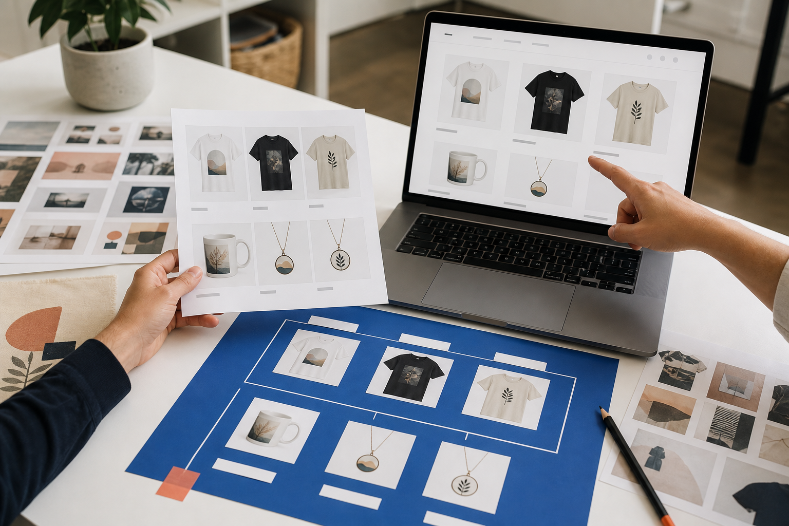
A Shopify portfolio-store study balancing full-size art viewing, edition and format details, collection browsing, and an owner-editable catalog.
View projectSelected Work
Look for readable hierarchy, clean production details, an idea that fits the buyer, and enough restraint to let the product speak.
Self-initiated work used to show craft and decisions. It carries no client identity, testimonial, or result.
Client projects remain unpublished until display permission, credits, and the exact scope of Prinil's work are recorded.

A Shopify portfolio-store study balancing full-size art viewing, edition and format details, collection browsing, and an owner-editable catalog.
View project
A mobile storefront study separating product suitability, dimensions, materials, care, and shipping from unverified lifestyle claims.
View project
A mobile Shopify storefront study organizing tea type, flavor, preparation, delivery context, and trust content before visual decoration.
View project
A multi-layer SVG scene study using bridges, overlap, and layer order to keep a detailed silhouette understandable.
View project
A tool-icon SVG set study focused on consistent geometry, sensible layer names, and clean negative space across several objects.
View project
A layered SVG study balancing an original monogram, weedable stems, enclosed counters, and a documented small-size limit.
View project
An illustration system study connecting three fictional garden announcements through shared shapes and different focal actions.
View project
A packaging-character study designed to retain expression across a primary label, small seal, and one-color stamp.
View project
An editorial illustration study translating a busy market theme into one focal exchange and a restrained supporting environment.
View project
A geometric coloring-page system testing repeatable motifs, open areas, margins, and sequence variety under one line standard.
View project
A story-spread study coordinating character scale, reading direction, text-safe space, and a page-turn reveal.
View project
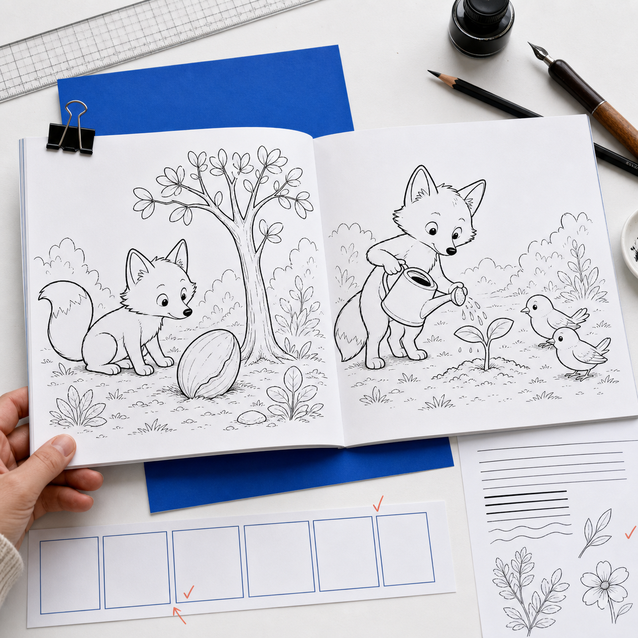
A coloring-book sequence study using recurring woodland characters, controlled line weight, and increasing page density.
View project
A relationship card study using distance as supporting context while keeping the giver-to-recipient message primary.
View project
A graduation-gift card system built around an occasion cue, a concise direction metaphor, and unobstructed product framing.
View project
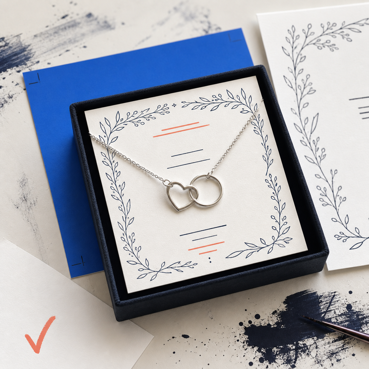
A ShineOn message-card study that gives the relationship, central sentiment, and jewelry frame distinct jobs at a small size.
View project
An outdoor-club apparel study that separates buyer identity, landscape shorthand, and secondary copy into a clear hierarchy.
View project
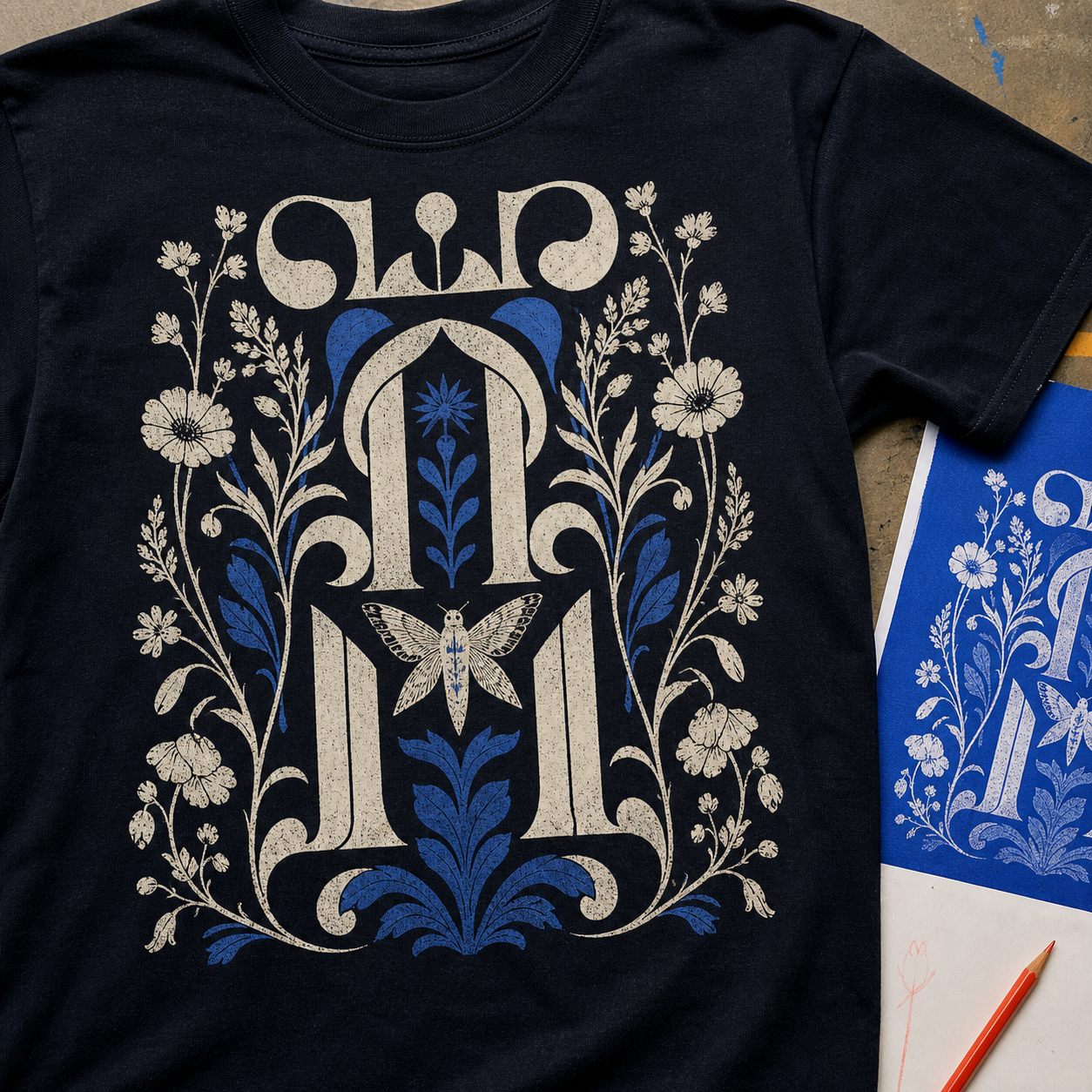
A dark-garment typography study using botanical interruptions without sacrificing the first reading of the phrase.
View project
An apparel badge study balancing trade identity, condensed type, and print-safe detail at listing and garment scales.
View projectThe evidence rule
Work pages show the brief, production constraint, decision, deliverable, and creator where verified. A commercial outcome appears only when its baseline, date range, source, attribution limit, and permission are recorded.
Explore services